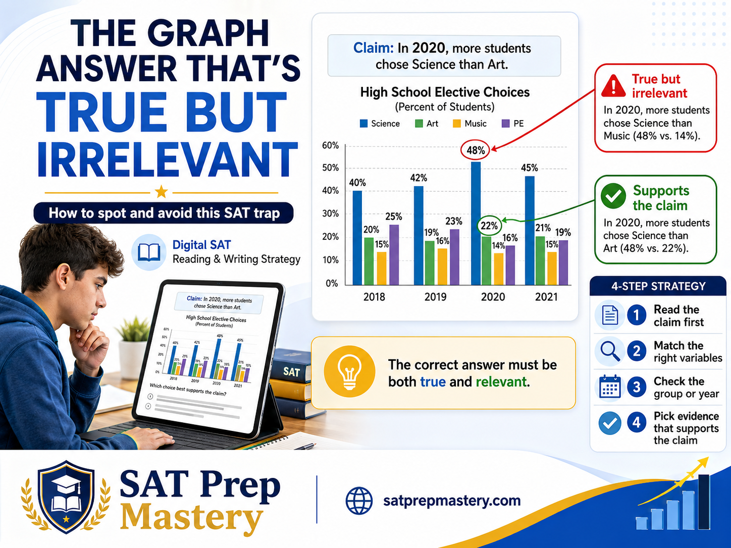
Digital SAT Graph Trap: When a True Answer Does Not Support the Claim
Quick answer: A graph answer can be factually correct and still be wrong. On Digital SAT Command of Evidence (Quantitative) questions, the test gives you four statements about a table or graph, and often two or three of them accurately describe the data. Only one supplies the evidence the claim actually needs. Identify the claim first, predict what would prove it, then check each choice for the correct variables, groups, measurements, and time periods.
The correct answer must be both true and relevant.
Here is the frustrating part about this question type: you can read the graph perfectly and still miss the question. That is not a reading problem. It is a matching problem, and it is fixable in about a week of focused practice.
These questions live in the Information and Ideas domain of the Digital SAT Reading and Writing section, under the skill College Board calls Command of Evidence, which comes in textual and quantitative forms. The quantitative version gives you a short passage containing a claim, plus a table or graph, and asks which choice most effectively uses the data to support that claim.
What Is the "True but Irrelevant" Graph Trap?
The trap is an answer choice that describes the data accurately but addresses something other than the claim.
Say a table shows rainfall in four cities across two decades. A researcher claims that Riverton's rainfall declined between 2000 and 2020. One choice says, "Ashville recorded the highest rainfall of any city in 2020." Check the table and that may be perfectly true. It is also useless, because the claim is about Riverton, about change over time, and about a decline. The choice discusses the wrong city, the wrong relationship, and a single year.
The SAT is not asking which statement about the graph is true. It is asking which true statement provides the evidence required by the claim.
That distinction is the entire question type.
Why Students Fall for This Trap
Choosing the first true statement they notice. Verification feels like success, so the brain stops early.
Focusing on the largest or smallest value. Big numbers attract attention, but size is rarely what the claim is about.
Reading the graph before understanding the claim. You end up hunting for something interesting instead of something specific.
Matching keywords instead of logic. A choice repeating words from the passage can still describe the wrong relationship.
Comparing the wrong groups. The claim names a population; the choice quietly swaps it.
Using the wrong year or category. True in 2015, irrelevant to a claim about 2023.
Ignoring units. Percentages, raw counts, and rates per capita tell different stories.
Confusing correlation with causation. Two lines moving together does not mean one moved the other.
Assuming a related fact must help. Being on-topic is not the same as being evidence.
Rushing. With roughly 71 seconds per Reading and Writing question, skimming feels efficient and costs points.
The Six-Step Method for Solving SAT Graph Questions
Read the claim before studying every detail in the graph.
Identify the variables, groups, dates, or categories named in the claim.
Predict what evidence would support the claim.
Locate only the relevant graph data.
Test each choice for truth and relevance.
Select the choice that most directly supports the claim.
Claim first. Evidence second. Answer choices last.
The Four Questions to Ask About Every Choice
Is the statement factually accurate?
Does it discuss the correct variables or groups?
Does it address the exact relationship in the claim?
Does it support the claim strongly enough?
A "no" to any one of these usually eliminates the choice. Notice that question 1 is only the first filter, not the whole test. Most wrong answers on this question type pass question 1 and fail somewhere in 2 through 4.
How to Read the Claim Before Reading the Graph
Before you look at a single number, pull these out of the sentence:
The subject of the claim
The comparison being made
The direction of change, if any
The population or category involved
The relevant time period
Whether the claim concerns a difference, a trend, an association, or a cause
Whether the evidence must support, weaken, or illustrate the claim
Use this template to force clarity:
The claim says that [group or variable] is [higher, lower, increasing, decreasing, or related] compared with [comparison group or condition].
If you cannot fill in every bracket, reread the sentence before touching the data. Ten seconds here saves thirty later.
Common True-but-Irrelevant Answer Patterns
The wrong group
The choice reports accurate data for a group the claim never mentioned.
The wrong variable
The claim is about cost; the choice discusses quantity. Both appear in the table.
The wrong time period
Accurate for 2010, irrelevant to a claim about the 2020 figures.
The largest-number distraction
The choice spotlights the biggest value on the chart when the claim is about a comparison, a proportion, or a change.
The general-trend distraction
The choice summarizes the overall pattern when the claim concerns one subgroup or one interval.
The reversed comparison
The right two values, stated backward. This one is factually false, and it catches students who recognize the numbers and stop checking.
The correlation-causation trap
The data show an association; the choice asserts that one variable caused the other. On the SAT, observational data almost never supports a causal statement.
The incomplete comparison
The claim requires two values, and the choice offers one. A single number cannot establish "higher than," "narrower than," or "faster than."
Truth vs. Relevance Comparison Table
Answer Choice Type | Is It True? | Is It Relevant? | What the Student Should Do |
|---|---|---|---|
Correctly describes the required comparison | Yes | Yes | Keep it |
Correctly describes another category | Yes | No | Eliminate it |
Uses the correct groups but reverses them | No | Yes | Eliminate it |
States a broad graph trend | Possibly | Not necessarily | Check the exact claim |
Uses one correct value without comparison | Yes | Usually incomplete | Look for direct evidence |
Claims causation from correlation | Not supported | No | Eliminate it |
Uses the wrong unit or year | Possibly | No | Eliminate it |
Original SAT-Style Practice Questions
Original practice questions written for this article. These are not College Board questions. They imitate the format of Command of Evidence (Quantitative) items so you can practice the reasoning.
Question 1 — Environmental Science
Carbon Stored in Seagrass Meadows (metric tons per hectare)
Site | Natural meadow | Restored meadow |
|---|---|---|
A | 142 | 61 |
B | 118 | 74 |
C | 96 | 70 |
D | 88 | 81 |
Coastal ecologists have questioned whether restored seagrass meadows can approach the carbon storage capacity of undisturbed ones. Reviewing data from four sites, a research team argued that at Site D, restoration has come close to matching natural storage levels.
Which choice most effectively uses data from the table to support the team's argument?
A) Natural meadows at Site A store 142 metric tons per hectare, the highest value recorded at any site. B) At Site D, the natural meadow stores 88 metric tons per hectare and the restored meadow stores 81. C) At Site C, the natural meadow stores 96 metric tons per hectare and the restored meadow stores 70. D) The restored meadow at Site B stores 74 metric tons per hectare.
Correct answer: B
The claim being tested: At Site D specifically, restored storage nearly matches natural storage.
Relevant variables and groups: Site D only; both meadow types; the size of the gap between them.
Why B works: It supplies both values the comparison requires, at the named site. The 7-ton gap is the smallest in the table, which is exactly what "come close to matching" means.
Why the others fail:
A is true and it is the largest number on the table, which is precisely why it is bait. Site A is not the subject, and one value cannot show two things are close.
C is true but describes the wrong site, and its 26-ton gap would undercut the claim rather than support it.
D is true, single-valued, and about the wrong site.
Trap alert: A is the classic largest-number distraction. Your eye lands on 142 before it lands on the word "Site D."
Question 2 — Biology
Seed Germination Rates by Soil Temperature
Soil temperature | Control group | Fungal-treatment group |
|---|---|---|
10°C | 22% | 51% |
15°C | 44% | 63% |
20°C | 68% | 79% |
A botanist tested whether a symbiotic fungal treatment improves seed germination. She concluded that the treatment's benefit was greatest under the coldest conditions.
Which choice most effectively uses data from the table to support her conclusion?
A) In the fungal-treatment group at 20°C, 79% of seeds germinated, the highest rate recorded in the study. B) At 10°C, germination rose from 22% in the control group to 51% in the treatment group, an increase of 29 percentage points. C) Germination rates increased as soil temperature increased in both groups. D) At 20°C, the control group's germination rate of 68% exceeded the treatment group's rate at 15°C.
Correct answer: B
The claim being tested: The treatment helped most at the lowest temperature.
Relevant variables and groups: The size of the control-to-treatment gap, compared across temperatures.
Why B works: It isolates the 10°C row and quantifies the benefit at 29 points, the largest gap in the table (versus 19 at 15°C and 11 at 20°C).
Why the others fail:
A is true and highlights the study's biggest number, but the claim is about benefit, meaning the gap between groups, not the raw germination rate.
C is true and describes a real trend, but it says nothing about where the treatment helped most.
D is true and mathematically checkable, but it compares across temperatures within mismatched groups, which has no bearing on the claim.
Trap alert: A and C are both accurate. Accuracy is not the test.
Question 3 — Economics
Share of Average Household Spending by Category
Category | 2015 | 2023 |
|---|---|---|
Housing | 31% | 36% |
Transportation | 17% | 12% |
Food | 13% | 14% |
Healthcare | 8% | 9% |
An economist studying shifting household budgets argued that between 2015 and 2023, families redirected spending away from transportation and toward housing.
Which choice most effectively uses data from the table to support the economist's argument?
A) Housing accounted for a larger share of spending than any other category in both 2015 and 2023. B) Food's share of spending rose from 13% in 2015 to 14% in 2023. C) Transportation's share fell from 17% to 12% while housing's share rose from 31% to 36%. D) In 2023, healthcare accounted for 9% of average household spending.
Correct answer: C
The claim being tested: Two simultaneous movements in opposite directions, transportation down and housing up, across a specific interval.
Relevant variables and groups: Housing and transportation only; both years; direction of change.
Why C works: It provides all four data points the claim requires and states both directions correctly.
Why the others fail:
A is true and feels important, but "largest category" is a statement about rank, not change. Housing could have been largest in both years while shrinking.
B is true and describes a real increase, but food is not in the claim.
D is true, single-valued, wrong category, wrong relationship.
Trap alert: A is a general-trend distraction dressed up as a headline fact. Rank and change are different questions.
Question 4 — Education
Average Independent Reading (minutes per week)
Grade | Program A | Program B |
|---|---|---|
6 | 95 | 82 |
7 | 88 | 101 |
8 | 76 | 118 |
A district evaluated two literacy programs and reported that by eighth grade, students in Program B were reading substantially more independently than their peers in Program A.
Which choice most effectively uses data from the table to support the district's report?
A) In grade 6, Program A students read an average of 95 minutes per week, compared with 82 minutes for Program B students. B) Program B students' average reading time increased from 82 minutes in grade 6 to 118 minutes in grade 8. C) In grade 8, Program B students read an average of 118 minutes per week, compared with 76 minutes for Program A students. D) In grade 8, Program A students read an average of 118 minutes per week, compared with 76 minutes for Program B students.
Correct answer: C
The claim being tested: A between-program comparison at one grade level, grade 8.
Relevant variables and groups: Grade 8 row; both programs.
Why C works: It gives both grade 8 values in the correct direction, a 42-minute gap favoring Program B.
Why the others fail:
A is true but describes grade 6, and it points the opposite way. Right table, wrong row.
B is true and shows real growth, but growth within Program B does not establish that Program B exceeded Program A.
D reverses the values. The numbers are right; the programs are swapped.
Trap alert: D is the reversed comparison. If you recognize "118 and 76" and stop reading, you will pick it.
Question 5 — Technology
Broadband Speed and Remote Work by Region
Region | Median download speed (Mbps) | Share of workers primarily remote |
|---|---|---|
North | 210 | 31% |
East | 165 | 26% |
South | 120 | 19% |
West | 85 | 14% |
Analysts noted a consistent pattern linking internet infrastructure to remote work. They cautioned, however, that their regional data could not establish that one factor produced the other.
Which choice most effectively uses data from the table to illustrate the pattern the analysts describe, without overstating it?
A) Faster broadband speeds caused more workers to shift to remote work. B) Regions with higher median download speeds also reported higher shares of remote workers. C) The North region recorded a median download speed of 210 Mbps, the highest of the four regions. D) The West region recorded both the lowest download speed and the lowest share of remote workers.
Correct answer: B
The claim being tested: An association exists, and the evidence must not assert causation.
Relevant variables and groups: Both variables across all four regions; the direction of the relationship only.
Why B works: It describes the co-movement across every region and stops there. That is exactly the strength of claim the analysts endorsed.
Why the others fail:
A asserts cause. The analysts explicitly ruled that out, and observational regional data cannot support it.
C is true and it is the biggest number, but a single region's speed says nothing about a relationship between two variables.
D is true and involves both variables, but one region is a data point, not a pattern. B covers all four.
Trap alert: C is true, prominent, and completely inert. D is true and nearly right, which makes it the harder distractor: it is incomplete rather than wrong.
Question 6 — History
Newspapers Published Annually, Selected Cities
City | 1850 | 1880 |
|---|---|---|
Ashford | 12 | 30 |
Brightwell | 4 | 20 |
Caldon | 18 | 34 |
Dunmore | 9 | 21 |
A historian studying regional print culture argued that the city with the smallest press presence in 1850 experienced the most dramatic proportional expansion by 1880.
Which choice most effectively uses data from the table to support the historian's argument?
A) Caldon published 34 newspapers in 1880, more than any other city that year. B) Ashford's output grew by 18 newspapers, the largest increase of any city. C) Brightwell published 4 newspapers in 1850 and 20 in 1880, a fivefold increase. D) Caldon published 18 newspapers in 1850, more than any other city that year.
Correct answer: C
The claim being tested: The 1850 minimum city showed the largest proportional growth.
Relevant variables and groups: Brightwell (fewest in 1850); both years; ratio, not difference.
Why C works: Brightwell had the smallest 1850 figure, and 4 to 20 is a fivefold increase, larger proportionally than Ashford (2.5x), Dunmore (about 2.3x), or Caldon (about 1.9x).
Why the others fail:
A is true and it is the table's largest value, but the claim concerns growth, not 1880 rank.
B is true, and this is the sharpest trap here: Ashford genuinely did post the largest absolute increase, 18 papers versus Brightwell's 16. But the claim says "proportional." Absolute and proportional growth are different measurements.
D is true but identifies the city with the most papers in 1850, the opposite of the claim's subject.
Trap alert: B is true, on-topic, and about growth. It fails on one word: proportional. This is the wrong-variable trap at its most subtle.
Question 7 — Public Health
Childhood Vaccination Coverage Before and After Mobile Outreach
Clinic type | Before outreach | After outreach |
|---|---|---|
Urban | 78% | 84% |
Rural | 52% | 71% |
A public health department introduced mobile vaccination units in rural areas. Officials concluded that the program reduced the disparity in coverage between urban and rural populations.
Which choice most effectively uses data from the table to support the officials' conclusion?
A) Urban coverage rose from 78% before outreach to 84% after outreach. B) The gap between urban and rural coverage fell from 26 percentage points before outreach to 13 percentage points after. C) After outreach, rural coverage reached 71%, which remained below urban coverage of 84%. D) After outreach, rural coverage of 71% exceeded urban coverage before outreach of 78%.
Correct answer: B
The claim being tested: The disparity between two groups narrowed. This requires comparing a gap at two points in time, so four values are in play.
Relevant variables and groups: Both clinic types; both time points; the difference between them.
Why B works: It computes the gap before (78 − 52 = 26) and after (84 − 71 = 13) and shows it cut roughly in half. That is precisely what "reduced the disparity" means.
Why the others fail:
A is true, but urban improvement alone says nothing about the gap. In fact, urban gains alone would widen a disparity.
C is true, and it confirms a gap still exists, but it does not show the gap got smaller.
D is false: 71% is not greater than 78%.
Trap alert: A is the purest form of this article's subject. Accurate, on-topic, drawn from the right table, and it does not touch the claim.
Question 8 — Art and Cultural Studies
Museum Exhibit Attendance, Annual Totals
Exhibit type | Total visitors | Visitors under age 30 |
|---|---|---|
Contemporary | 12,400 | 5,580 |
Classical | 18,600 | 4,092 |
A museum director argued that contemporary exhibits are more effective than classical exhibits at drawing younger audiences as a share of their overall attendance.
Which choice most effectively uses data from the table to support the director's argument?
A) Classical exhibits drew 18,600 visitors, more than contemporary exhibits drew. B) Contemporary exhibits drew 5,580 visitors under 30, while classical exhibits drew 4,092. C) Visitors under 30 made up about 45% of contemporary exhibit attendance but about 22% of classical exhibit attendance. D) Contemporary exhibits drew 12,400 total visitors during the year.
Correct answer: C
The claim being tested: A comparison of proportions, not raw counts. The phrase "as a share of their overall attendance" is doing all the work.
Relevant variables and groups: Both exhibit types; under-30 visitors relative to each type's total.
Why C works: It converts both rows to shares (5,580 of 12,400 is about 45%; 4,092 of 18,600 is about 22%) and compares them directly.
Why the others fail:
A is true and it is the largest number in the table, but total attendance is not the claim. Classical could draw more people overall while attracting a smaller share of young visitors, which is exactly what happened.
B is true and tempting, since contemporary does lead in raw under-30 count. But raw counts do not establish a share, and a claim about proportions needs proportions.
D is true, single-valued, and does not compare anything.
Trap alert: B is the best distractor in this set. It uses the right groups, the right variable, and the right direction. It just answers a different question than the one asked.
Detailed Trap Walkthrough
Here is how a careful student gets one wrong.
The setup: A table shows average annual snowfall for four mountain observatories in 1990 and 2020. Peak Station: 310 cm to 244 cm. Ridge Station: 280 cm to 262 cm. Vale Station: 195 cm to 141 cm. Summit Station: 355 cm to 338 cm. A climatologist claims that Vale Station experienced the steepest proportional decline in snowfall over the period.
Step 1: Restate the claim
Vale Station. Decline. Proportional, not absolute. 1990 compared with 2020.
Step 2: Identify the required evidence
Two numbers from Vale, expressed as a ratio or percentage drop, ideally shown to exceed the other stations' proportional drops.
Step 3: Locate the relevant data
Vale: 195 to 141. That is a drop of 54 cm, or about 28%. Peak: 310 to 244, a drop of 66 cm, about 21%. Ridge: about 6%. Summit: about 5%.
Step 4: Test whether each answer is true
Suppose the choices are:
A) Summit Station recorded the highest snowfall in both 1990 and 2020. True.
B) Peak Station's snowfall fell by 66 cm, the largest decrease of any station. True.
C) Vale Station's snowfall fell from 195 cm to 141 cm, a decline of roughly 28%. True.
D) Vale Station recorded the lowest snowfall of any station in 2020. True.
All four are true. This is what makes the question type hard, and it is why "is it true?" cannot be your only filter.
Step 5: Eliminate true but irrelevant choices
A is about rank, not decline, and about the wrong station. Out. D is about Vale, but "lowest in 2020" is a rank statement, not a change statement; a station can be lowest without having declined at all. Out. B is the dangerous one. It is about decline, it is about the right period, and 66 cm genuinely is the biggest drop. But it is the biggest absolute drop at the wrong station, and the claim says proportional.
Step 6: Choose the most direct support
C. It names Vale, gives both endpoints, and expresses the change as a percentage, matching the claim's word "proportional."
The failure mode: A student who reads the graph flawlessly can still choose B. They correctly computed the largest decrease. They simply answered "which station dropped the most?" instead of "which station dropped the most proportionally?" Nothing about their data reading was wrong. Their claim reading was.
Graph Trap Decision Table
Trap Situation | Tempting Student Reaction | Better Strategy | Detail to Verify |
|---|---|---|---|
Choice states a correct number | Select it immediately | Match it to the claim | Group and variable |
Choice mentions the largest value | Assume it is important | Ask what comparison is required | Claim direction |
Graph shows an overall trend | Choose the trend summary | Check whether the question asks about one subgroup | Population |
Two values are accurate | Assume the comparison is correct | Verify which is higher or lower | Direction |
Variables move together | Claim one caused the other | Limit the conclusion to association | Study design |
Time is running out | Scan for matching words | Restate the claim in plain English | Exact evidence needed |
A Fast 30-Second Graph Routine
Underline the claim.
Circle the named groups, variables, and dates.
Predict the comparison needed.
Find the relevant values.
Reject choices that are true but answer a different question.
Select the most direct evidence.
Steps 1 through 3 should take about ten seconds and they are the ones students skip when the clock gets loud. They are also the ones that prevent the trap. Predicting before you read the choices means you arrive with a target instead of shopping for something plausible.
How SAT Prep Mastery Helps Students Spot Graph Traps
Learning the correct answer letter teaches you almost nothing on this question type. What actually transfers is being able to say why the wrong answer was tempting, out loud, in one sentence. "It was true but it used total attendance instead of share." Once a student can name the trap, they start seeing it coming.
That is the kind of practice SAT Prep Mastery is built around: targeted Command of Evidence (Quantitative) practice with trap-based answer choices, immediate explanations that break down each distractor rather than just confirming the key, and an online SAT tutor available for follow-up questions when a distractor still feels right after you have read the explanation. That follow-up conversation is where the reasoning actually clicks.
On top of that, mistake classification separates "I misread the data" from "I read the data and matched it to the wrong claim," which are completely different problems with different fixes. Adaptive recommendations then send more of the question type you are actually missing, and a personalized SAT structured plan schedules that work into your week with progress tracking, so you can see whether the error pattern is shrinking. No platform can promise a specific score change, but a student who can articulate why each distractor is wrong is in a much better position than one who has memorized answer keys.
Final Student Checklist
[ ] Did I identify the exact claim?
[ ] Did I note the correct groups and variables?
[ ] Did I check the units and dates?
[ ] Did I predict the evidence before reading the choices?
[ ] Is the choice factually true?
[ ] Is the choice directly relevant?
[ ] Does it provide the full comparison?
[ ] Am I confusing association with causation?
[ ] Am I being distracted by the largest number?
[ ] Can I explain how the data supports the claim?
Frequently Asked Questions
What are quantitative evidence questions on the Digital SAT?
They are Command of Evidence questions in the Information and Ideas domain that pair a short passage containing a claim with a table or graph. You choose which piece of data most effectively supports, completes, or illustrates that claim. They require only basic number sense, not math skills.
Can a factually correct graph answer still be wrong?
Yes, and this is the most common way students lose these points. Several choices usually describe the data accurately. Only one addresses the specific claim, with the right groups, variables, and time period.
How do I identify the claim in an SAT data question?
Look for the sentence stating what a researcher, writer, or study concluded, often just before the question. Then name its subject, its comparison, its direction, its population, and its time frame before looking at any numbers.
Should I read the passage or graph first?
Read the passage and claim first. Reading the graph first leads you to notice whatever is visually striking, which is rarely what the claim needs, and it primes you to fall for the largest-number distractor.
What should I do when two answer choices are true?
Assume both are true and test relevance instead. Ask which one names the exact groups and variables in the claim and provides the complete comparison. Truth is the first filter, not the deciding one.
How can I avoid choosing the largest number?
Predict the evidence before reading the choices. If your prediction was "compare Site D's two values," a choice about the table's maximum will not match your prediction and you will skip past it instead of being pulled toward it.
Does correlation prove causation on the SAT?
No. When a passage presents observational data showing two variables moving together, any choice asserting that one caused the other is almost always wrong. Limit the conclusion to association unless the passage describes a controlled experiment.
How do I solve SAT graph questions faster?
Spend your first ten seconds on the claim, not the data. Locating only the two or three relevant values is far faster than reading an entire table, and it eliminates most choices before you finish reading them.
What if the graph contains a lot of irrelevant data?
That is deliberate. Extra rows, columns, and categories exist to supply true-but-irrelevant distractors. Identify the claim's variables first, then read only those cells and ignore the rest.
Can an AI SAT tutor help with graph questions?
Yes, particularly for the follow-up question after an explanation, when a wrong choice still seems defensible. Asking "why isn't B right when it uses the correct groups?" is where the reasoning gets internalized. Attempt the question first and ask for hints before full answers.
Learn to Match the Evidence to the Claim
The skill here is small and learnable: read the claim, predict the evidence, then let true-but-irrelevant choices slide past you. Students usually see improvement on this question type within a couple of focused sessions, because the error is a habit rather than a knowledge gap.
SAT® is a trademark registered and owned by College Board®, which is not affiliated with and does not endorse this product or site. All practice questions in this article are original and written for illustration. Digital SAT details can change; verify current test information through College Board and Bluebook. Last verified: July 17, 2026.
7. References
Official College Board / SAT Suite
The Reading and Writing Section (content domains, passage lengths, informational graphics) — https://satsuite.collegeboard.org/sat/whats-on-the-test/reading-writing
How the SAT Is Structured (module timing and question counts) — https://satsuite.collegeboard.org/sat/whats-on-the-test/structure
What Are Content Domains? — https://satsuite.collegeboard.org/practice/content-domains
Digital SAT Suite Specifications Overview — https://satsuite.collegeboard.org/media/pdf/digital-sat-test-spec-overview.pdf
How to Use the Student Question Bank — https://satsuite.collegeboard.org/practice/student-question-bank
Full-Length Digital Practice Tests on Bluebook — https://satsuite.collegeboard.org/practice/practice-tests/bluebook
Learning Science
Dunlosky, J., Rawson, K. A., Marsh, E. J., Nathan, M. J., & Willingham, D. T. (2013). Improving Students' Learning With Effective Learning Techniques. Psychological Science in the Public Interest, 14(1), 4–58 — https://journals.sagepub.com/doi/abs/10.1177/1529100612453266
Terminology note: "Command of Evidence (Quantitative)" is College Board's designation for this skill within the Information and Ideas domain of the Digital SAT Reading and Writing section. All practice questions above are original and do not reproduce College Board content.